January 2012 / For the Years to Come
-
 Offenbach / Galerie Gruen
Located throughout the world, the Trendease Team continues to deliver our subscribers around the globe must-know market information and inspiration straight to their computer screens.
A new year is upon us. Let us try to leave the turbulence of the past behind and use the blank slate of 2012 to build a positive future. Uncertainty still looms, but let us not dwell on the gloom; let us focus on what we can change. Color stories for 2012 through 2013 reflect the emotional state of the people around the globe. We also see heavy influences from yesteryear with the hope for tomorrow and the ability to seize the moment and design around it! Get inspired with the January edition!
We attend over 100 design events a year on your behalf to bring you trend insights and design movements to help you maintain cutting-edge knowledge of the lifestyle and design markets. Currently we keep readers in 10,265 cities within 167 countries/territories in the know! Are you reading Trendease.com?
Show us what youve got! For editorial consideration please email editorial@trendease.com with your latest original designs. Upcoming Trendease Market Edge PowWows and Trendease.TV scheduling can be found on the homepage.
REPORTING TO INSPIRE,
Jennifer Castoldi,
Chief Creative Director
Download our informative tri-fold brochure as a PDF file here.
Features and Articles
|
Jennifer's January JotsWorldwide — Happy New Year dear readers! Another year is upon us and let us take this as an opportunity to leap forward with a positive outlook and a clean slate. Undoubtedly the last few years have been turbulent for many people and companies, but let this not hold you back or bring you down! Here within we have a selection of products scouted from around the globe with one thing in common: a great sense of humor. Prepare to have your funny bone tickled. |

|
Trends in Living 2012/13: Neo PurityWorldwide — Trendease presents to its readers a preview of the Trevira Trends in Living 2012/2013 that will be unveiled during Heimtextil, January 11-14, 2012, in Frankfurt, Germany. With interiors it is the materials that are mainly responsible for creating a variety of moods. Use is made of sensual fabrics with a soft or heavy feel, supplying warmth, calm and security. Learn more here! |
|
Trends in Living 2012/13: Cozy NutshellWorldwide — A successful future rests on having the courage to overcome fear. In addition, an awareness of traditions and the value of a good brand are pillars on which we can build. Both are far from the feeling we have to be cool or superficial. They provide stability when the cries well up again, they survive crises and face up to fear. Learn about Cozy Nutshell here. |
|
Trends in Living 2012/13: Geisha ReloadedWorldwide — Gossamer, translucent qualities ensure an ethereal lightness, as they play with light and shade. Courage is to be found in the colors, which are consciously selected for their power. They are mostly warm and make a strong statement. In contrast to this, powdery tones make for a gentle and lighter trend in designs. More on Geisha Reloaded inside! |

|
Trends in Living 2012/13: Spur of the MomentWorldwide — The many uncertainties that at present govern our lives stem from the financial markets. Looming over us are questions, which quickly make us forget that there is more to life than daily headlines. A positive feeling to life and personal relationships is indispensable for the straight path into the future. |

|
S/S 2013: BeginningsWorldwide — Trendease welcomes its readers to get an avant premiere look at the spring/summer 2013 trends that will be presented by Le Cuir à Paris in February 2012 under the theme LOVE. It seems almost natural to compare Love with Design. These two movements transcend our daily lives and involve taking risks, going out on a limb. Learn about the beginnings here. |

|
S/S 2013: IdyllWorldwide — In 2013 we see Idyll, which represents the elation of the love-filled Eden. Colors are inspired by houses in the Caribbean and for this season we will see that they are transformed into everyday use. Read more within and see a color story that reflects the mood of this design direction. |

|
S/S 2013: FrenzyWorldwide — Frenzy brings us burst of bright colors, the overall feel being very close to kitsch. This excess of passion exudes newness and takes influence from India, is rich with strange textures, and is a full-fledged artificial paradise. Subscribers can see the colors and read more about this 2013 direction within. |

|
S/S 2013: RepetitionWorldwide — In Repetition, love becomes familiar and needs to be reinvented for Spring/Summer 2013. Established values come to the forefront. The color story, that can be seen here, evokes the future yet has heavy references to the past. Officers uniforms, Ferrari, British trench coats, the 1960s dream of La Dolce Vita |

|
S/S 2013: QuarrelWorldwide — Jealousy, vendettas, violence. Quarrel is far from lovey-dovey. The color story presented here for S/S 2013 reflects the heavy mood. It is no surprise to find dark hues, including shades of red, greys, and dried earth tones. |

|
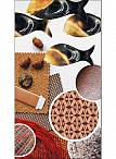
S/S 2013: I Love GreenWorldwide — In the Spring/Summer 2013 green is much more than a word associated with sustainability and responsible design. The love affair with green ranges from algae to chameleons to macaws to emeralds, from India to the Aegean Sea. Subscribers can see the international, versatile color palette here. |

|
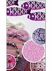
NEWSLETTER #383 - Crisscrosses & WeavesMultiple European Cities — For this weeks newsletter explore a new world of crisscrosses and weaves. The past meets the present and technology is intertwined with craft in this wide-ranging display of designs ranging from furniture to handbags to the latest textiles. Chosen from our international travels, discover innovative creations here! |
|
NEWSLETTER #384 - Heimtextil 2012/13 TrendsFrankfurt — We are delighted to bring you exclusive coverage from Heimtextil. And as we know, Heimtextil kicks off the trade year, often times acting as indicator for the year ahead. We realize that you are dying for coverage of the trends presented at the exhibition. Without further ado the Trendease Team and Heimtextil Trendtable are pleased to bring you the 2012/13 theme of Montage, video, images, and descriptions are found here. |

|
Heimtextil 2012/13 Trend: Color RiotFrankfurt — Open, bold, eye-catching a call to action by light and color. Color Riot sets the scene for a new lifestyle feel. Emerging from a synthetic artificiality into the everyday world, the energy-laden, vibrant tones radiate with self-assurance. The ease with which color, light and material are combined is stimulating and infectious. An ultra-modern and grown-up style puts color in a contemporary context. The world is in motion! |

|
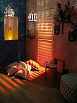
Heimtextil 2012/13 Trend: Dark LuxFrankfurt — Welcome to the dark. Attracted by the silvery moonlight, dark mystical beauties move through an elegant, contemporary world. Modern vamps give expression to their dark side. They are strong, emotional and reflective. They satisfy their desire for beauty with glossy, high-quality materials. Their style is sculptural and their decorations perfectly shaped. Masculine strength is combined with luxurious elegance. From their cool, modern charm emerges a bizarre fascination. |

|
Heimtextil 2012/13 Trend: Craft IndustryFrankfurt — The combination of the traditional, handcrafted and handmade with the industrial and mechanical characterizes the look of Craft Industry. Tradition, naturalness and craftsmanship are brought to life with local, ritual, down-to-earth emotive vigor. Objects worth preserving are reused, restored and adapted. Stylistic influences and inspirations come from native rural and folk traditions. Used and worn items have a rough and stylish charm. The demonstration of clear, simple techniques and creation processes forms a refined counterpart to digital reality. |

|
Heimtextil 2012/13 Trend: Split ClarityFrankfurt — Relaxed, comfortable and pure. In Split Clarity things work by themselves. Theres nothing superfluous here. Less is more. A focus on the simple, functional and essential informs the clean, modern style. The all-pervading cool freshness is interrupted only by the natural warmth of the wood. Power, calmness and purity are expressed in the harmony of opposites: soft and hard, round and linear, light and compact, graphic and bulky come together. Sustainability, quality, high-tech and new materials are at the center. |

|
NEWSLETTER #385 - Lifestyle InteriorsCologne — This weeks newsletter and added galleries feature room settings by G+J Events on display at LivingInteriors, the new international event for interior furnishing that is now premiering in parallel with imm cologne in hall 4.2. LivingInteriors is an approach to holistic interior and furnishing concepts, showcasing companies that represent bathroom fixtures, flooring, walls, and lighting. |

|
The Classic EnthusiastCologne — This room has a lounge character and feel-good ambience, which is be created by dimmed light and low seating elements. Warm grey wall colors, wooden colored floors, and carpets form an extraordinary but still warm atmosphere. The leather sitting room suite in the shade Viola creates a comfortable environment, which is an invitation for staying and chatting. |
|
The Orient EnthusiastCologne — This room is staged as Moroccan Riyadh. Elements typical for the country, like the dominating color turquoise, create a stunning impression. A mosaic and water basin filled with roses and little fountains in a combination with warm orange-colored lights, to contrast with the turquoise, brings additional charm into this world. |
|
The Nature EnthusiastCologne — Nature and style are not mutually exclusive. With a green moss wall, an oak whitewashed wooden floor, and pieces of furniture in European walnut, this sleeping room creates a stylish nature ambiance and invites to relax and recover. This harmonious combination of close-to-nature materials and dominating earth and flat tones creates a natural interior style. |
.jpg)
|
NEWSLETTER #386 - The Contract MarketMultiple European Cities — One of the trends which is quite evident at trade shows is that organizers are paying more attention to, and spotlighting, contract exhibitors. What is a contract exhibitor, you ask? It is a company that can cater to the contract market, which is comprised of architects, interior designers, hoteliers, developers, local authority buyers, and many other projects outside of the residential market. This weeks gallery of images is a great example of design directions that are taken by the contract market. |