October 2015 / Yin and Yang Design Duality
-
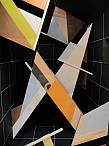
 Paris / Maison&Objet
Located throughout the world, the Trendease Team continues to deliver our subscribers around the globe must-know market information and inspiration straight to their computer screens.
Yin Yang is a balance between two opposites. Dualism is prevalent in design now. Inspiration from our heritage aids in designing with technology for our future. There are advantages in modern innovation and tradition. What is valuable? At Maison&Objet we look at the Precious trend where the definition of what is prized ranges from time to a diamond ring; raw materials and the talent and know-how to create worth from them. Theory, products, and color palettes take design to the next level. Get inspired with the October edition!
We attend over 100 design events a year on your behalf to bring you trend insights and design movements to help you maintain cutting-edge knowledge of the lifestyle and design markets. Currently we keep readers within 173 countries/territories in the know! Are you reading Trendease.com?
Show us what youve got! For editorial consideration please email editorial@trendease.com with your latest original designs. Upcoming Trendease Market Edge PowWows and Trendease.TV scheduling can be found on the homepage.
REPORTING TO INSPIRE,
Jennifer Castoldi,
Chief Creative Director
Download our informative tri-fold brochure as a PDF file here.
Features and Articles
|
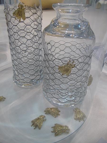
Jennifer's October ObservationsParis — The Trendease Team has been reviewing the thousands of images and hundreds of press kits we have accumulated in the last month. While we cross reference and organize the information it is already clear that duality is an integral word for 2016. Earth, smell, money, sight, friends, time, air, nature, love, family, beauty, excellence, data, identity, water, knowledge, memories, know-how, and taste. These are just some of the Precious items found at Maison&Objet so delicately displayed under bell jars. Come to learn about Yin and Yang Design Duality here. |
|
What is Precious Now?Paris — This September Maison&Objet shifted from three trend themes to one, Precious, the first inspiration forum part of a new rotation of the Observatory. The theme was chosen collectively and then materialized at the hands of Elizabeth Leriche, staged by Vasken Yeghiayan. With many of the items seen on display, there was a lot more than met the eye, which is why we selected a number of the artists statements to share with you that coincide with the 100+ images we took of the exhibition. |
|
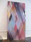
Looking Both WaysLondon — During the London Design Festival, at Tent, Dulux, producer of paint for the interiors industry, collaborated with a team of hot design talent to unveil the publication ColourFutures 16, which this year motivates us to revel in opposites and duality with the principal theme Looking Both Ways. Learn about the dominant color of the year and the four directions the team of international experts in architecture, textiles, product design, graphics and research industries has developed. |
|
Heritage & FutureLondon — Contemporary vintage? By reflecting upon the past we are able to move forward and design for the future in Heritage and Future. Knowing where you come from helps you to pave the road to the future. This 2016 Dulux color story hones in on reds to reflect a rich heritage, and at the same time has a bright modern-day feel that points to the future. A color palette and room settings help to envision this direction. |
|
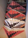
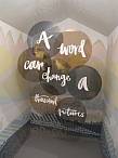
Words & PicturesLondon — It is printed, A picture may paint a thousand words but with so much imagery overloading us, do we trust the written word more? Colors of blue ink from pens and graphite from pencils contrast the hues often seen on the screens of smartphones and social media sites. The palette is adapted for interior use. Letters are used as decoration. Graphic simplicity takes over. |
|
Dark & LightLondon — The Dutch masters were brilliant with their play of light in darkness. A tiny accent could transform a painting. For many of us today the city lights are blinding and rob us of the dark of night that is needed for a sound evening sleep. This palette returns the darkness to us with deep hues of blue, green, and both cooling and warming neutrals. Ombré paint effects are also key for this design direction. |
|
The Grid & Letting GoLondon — Modern day technology has resulted in a basic human desire to go off grid and distance oneself from the hustle and bustle of life. But freedom is only understandable within the context of a framework you cant break the mold if you dont have a mold in the first place. Hence the colors in this palette are vivid and playful, yet they are still held back by the black and white of the grid. This trend also sees a number of graphical painting techniques at play to represent the grid. |
|
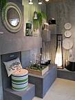
Urban NatureParis — The trend forum at this Septembers Maison&Objet from Ateliers dArt de France explores the rich association between creation and nature. A four-part dialogue created by Elizabeth Leriche under the name of Surnature is composed of Urban Nature, Precious Nature, Blissful Nature, and Mysterious Nature. |
|
Precious NatureParis — In Precious Nature giant tropical leaves decorate interiors both authentically and as prints. Gold leaf, golden paint, and the precious metal itself adorn products from jewelry to ceramics to the fixtures of the lighting and the hinges of the containers. Everything has its place and is on display in frames, cabinets, boxes, cages, and bell glasses. |
|
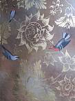
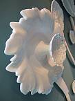
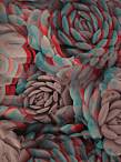
Blissful NatureParis — Enter Blissful Nature and it is a lot like a fantasy world where the flowers are supersized, the fauna are miniaturized, the garden is on the ceiling, and the blossoms are of ceramics. Humming birds and butterflies waltz through the air. Happy pastels and rainbow brights decorate the products; otherwise, it is pure white that reigns. |
|
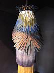
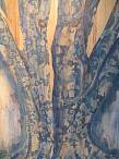
Mysterious NatureParis — Awaken in a snow covered forest where the birch trees command attention and the woods are saturated with inspiration woods that brag about their delicacy or their sturdiness. There is beauty in both. Painted patterns, earthenware mimicking nature, plus furniture and accessories that are just as home in the timberland as in the living room, Mysterious Nature is getting in touch with what is outside and within. |
|
NEWSLETTER #528 - Ambiente Trend PreviewFrankfurt — In this weeks newsletter and gallery we share a sneak peek of what stilbüro bora.herke.palmisano has prepared for the Ambiente trend areas to be realized at the fair in February 2016. Four trend groups are developed for one of the worlds largest consumer goods fairs. Learn about them here! |
|
NEWSLETTER #529 - Go Crazy with CreativityBrussels — Launch Pad is a fresh initiative by MoOD, curated by Trendease International, showcasing some of the brightest talent entering the home fashion arena scouted from around the world. The Launch Pad introduces talent utilizing the latest technologies and experimenting with cutting-edge materials, bringing together such eye openers as conductive embroidery, edible lace, and special fish leathers. At MoOD 2016 we plan to double the offer! |
|
NEWSLETTER #530 - Featured on National TVBrussels — The tidbits within come straight off the Innovation Platform, one of MoODs biggest attractions; part of which Trendease had the pleasure of curating. The highlight of this week was when Trendease was featured on US national television on the TV show Designing Spaces. For those of you who may have missed it on the telly (or dont live in America) you can find the episode online here. |