February 2019 / A Smorgasbord of Trends
-
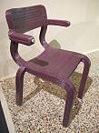
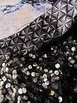
 Cologne / imm cologne
Located throughout the world, the Trendease Team continues to deliver our subscribers around the globe must-know market information and inspiration straight to their computer screens.
The winter trade show season is in full swing! This month we deliver to you a recap of Januarys most influential trend presentations and design directions, which help you stay relevant in todays fast-paced world. Pantone color references are included in a number of the galleries. From textiles to furniture to home accessories and housewares, they are all here. Get inspired with the February edition!
We attend over 100 design events a year on your behalf to bring you trend insights and design movements to help you maintain cutting-edge knowledge of the lifestyle and design markets. Currently we keep readers within 173 countries/territories in the know! Are you reading Trendease.com?
Show us what youve got! For editorial consideration please email editorial@trendease.com with your latest original designs. Upcoming Trendease Market Edge PowWows and Trendease.TV information can be found on the homepage.
REPORTING TO INSPIRE,
Jennifer Castoldi,
Chief Creative Director
Download our informative tri-fold brochure as a PDF file here.
Features and Articles
|
Jennifer's February FablesCologne — January is a month chock-a-block with design events. The February issue of Trendease is our opportunity to share with you a plethora of the trend presentations highlighted at the shows. Over the course of the month you will see a number of galleries covering a smorgasbord of design directions that prepare you for the seasons to come. |
|
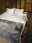
A Crossing of Influences and CulturesParis — Maison&Objet has a new approach to how they present the latest lifestyle movements in decor and has asked forecaster Elizabeth Leriche to stage three major trends. The first, presented within this gallery is Ethnic Arty which, reveals a desire for diversity, a crossing of influences and cultures, and updates expressions of authentic artisanal skill and craftsmanship, using materials and techniques to add a twist with unique creative designs. |
|
Rhythms of Color and PatternParis — The second trend of three, staged by Elizabeth Leriche for Masion&Objet, is here. Luxury Graphic explores rhythms of color and pattern, paired with corresponding precious materials, and revamps it all with the sophistication of a heritage feel, from Art Deco through to the 1970s and a decorators mindset. |
|
Contemplative Elemental SimplicityParis — This third trend offers variations on contemporary minimalism and elemental simplicity, driven by the strength of raw materials and the simplicity of architected, sculptural shapes, in a contemplative atmosphere. Walk into this area and a feeling of Zen washes over you. Soothing colors, and humble materials, create a peaceful environment. |
|
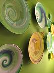
Flavors for the EyeParis — As seen with this display titled Flavors from François Bernard, Maison&Objet has a new method to how they showcase the latest lifestyle movements in tableware. Though each of the flavors is defined by a color harmony, its style, on the other hand, favors a blend of past/present/future, resonating with the current taste for connections (synesthesia) and free, creative combinations. |
|
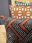
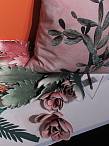
Local Style with a Cultural MixParis — Here is another display from Flavors by François Bernard at Maison&Objet. Spicy embraces local style with a cultural mix and is inspired by worldly street food. The color palette is made up of a wide range of reds, terracotta, clay, rose-coral, ochres, and saffron. Handmade effects and clay textures are lumpy, rustic, rusty, embossed, and hammered. Also included are Pantone color references. |
|
Bitter is Classic Style RevisitedParis — Here creative evolutions are presented in terms of color, material, and shape for new tableware products. Bitter is represented by the classic style revisited. Within we see a range of leafy greens, forest green, blue green, and accents of purple coupled with Pantone references. This vegetal inspiration is a mix of 18th century European style and design. |
|
Simultaneously Rustic and ContemporaryParis — What other flavors tickled out taste buds and dazzled our eyes at the recent Maison&Objet? Simultaneously rustic and contemporary, Salty is a neo naturalistic style. For this tabletop trend the textures are spotted, porous, and crystalized, with rough and irregular surfaces. This color palette featuring Pantone references ranges from white to black, pink to grey, with touches of cobalt. |
|
Sweets Your Dentist Won't MindParis — The final flavor of 2019 is sugar coated. Poetic metaphors between colors and flavors reveal all thats new in color ranges and textures. Sweet is a contemporary style that is playful, artistic, and chic. Melting textures are smooth as well as transparent. Surfaces can also be matte with velvet aspects. This saccharine palette of pastels contains Pantone references. |
|
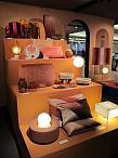
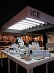
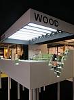
NEWSLETTER #631 - 3 Trends in Leisure DesignParis — François Delclauxs Whats New? leisure and culture space takes you on a journey to three ideal destinations: Ice, Wood and Sun. This weeks newsletter comes in the form of three galleries that showcase the latest trends in travel accessories, stationery, games, smart objects and gifts under three leisure showcases. |
|
Traveling to Sun LandParis — And for the final place Sun land, where all the items exude a summery vibe and pack a colorful punch. A very 1950s Miami-esque vibe that puts coral pink center stage its even been elected color of the year by Pantone (living coral), says Delclaux. Here you can find latest trends in travel accessories, stationery, games, smart objects and gifts. |
|
Hipster & NaturalParis — François Delclaux explains, My starting point was the concept of travel, the ultimate leisure activity! I whisk visitors off to three fictitious countries Wood land, celebrates wood and all things hipster and natural; An increasing amount of wood has started popping up in the most unexpected places, being used for iPhone covers, perfumed candle holders, spectacles and even technological devices. |
|
NEWSLETTER #632 - 7 Interiors PersonifiedCologne — In this weeks gallery subscribers will uncover seven trend themes for interior design (everything from ceramics to furnishings to floor coverings) that are interpreted as personifications of style in room settings. Everyones home tells a story about who they are, what they believe in, and about the things they love. A house is a pile of bricks, a home is an identity card. |
|
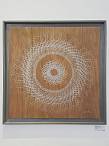
NEWSLETTER #633 - Art, Machine & ManLondon — Its always refreshing to venture beyond trade shows. This week we went to see Damien Borowiks solo exhibition at Jeannie Avent Gallery in East Dulwich, London, open through February 26th. One of the many things that fascinates us about art is how you can look at it and interpret it one way, and then when you learn the artists perspective that initial impression can entirely change. |