March 2010 / Color Me Authentic
-
 Paris / Première Vision Leather (Le Cuir à Paris)
Located throughout the world, the Trendease Team continues to deliver our subscribers around the globe must-know market information and inspiration straight to their computer screens.
Today we are reimagining our world. Optimism creeps in. We question thoughts, beliefs, and processes. We stand up to the harsh reality and conversely take a journey into a far off land of make-believe. Colors and surface interests paint our universe. In Color Me Authentic buzzwords include emotionality, process, originality, serenity, fantasy, and contrast. Discover design directions and Pantone palettes for many home and fashion items here. All of this and more get inspired with the March edition!
We attend over 100 design events a year on your behalf to bring you trend insights and design movements to help you maintain cutting-edge knowledge of the lifestyle and design markets. Currently we keep readers in 7,351 cities within 157 countries in the know! Are you reading Trendease.com?
Show us what youve got! For editorial consideration please email editorial@trendease.com with your latest original designs.
Upcoming Trendease Market Edge PowWows and Trendease.TV scheduling can be found on the homepage.
REPORTING TO INSPIRE,
Jennifer Castoldi,
Chief Creative Director
Download our informative tri-fold brochure as a PDF file here.
Features and Articles

|
Jennifer's March MusingsParis — Rather than look into a crystal ball to guess what will come to fruition between now and 2012, the Trendease Team journeyed around the globe to consult various well-known international resources. After this voyage we bring you a vast number of color stories for the coming years. Approximately 25 palettes are here for you to find inspiration for your product selection or development. But colors are not all that we bring you! There are a number of lifestyle shifts taking place to which you should be aware. Find our more here. |

|
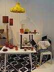
Genuine + SincereFrankfurt — In this trend from Ambiente see how mix of old and new creates a casual, self-evident style. View a collection of images from the show, read about the materials in use, and note the color story containing Pantone color references. Utilize this as a tool for shopping in 2010. |
|
Present + EverlastingFrankfurt — Opposites attract in this trend from Ambiente. Modernity and classicism, tradition and timelessness join together to form interior aesthetics. View a collection of images from the show, read about the materials in use, and note the color story containing Pantone color references. Exploit this as a style for 2010. |
|
Progressive + SensitiveFrankfurt — For 2010 organic shapes contrast with the architectural, the functional and the constructed. Here explore a selection of product images from the exhibit, read about the materials being utilized, their design inspirations, and note the color story containing Pantone color references. |
|
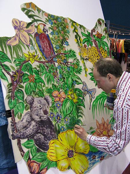
Crafted + OriginalFrankfurt — Affectionate, imperfect, individual, boundlessly creative styles are created by hand, combining charm with ethno-styling. Discover a selection of product images from Ambiente 2010, read about the materials being utilized, design influencers, and note the color story containing Pantone color references. |
|
Questioning the GurusFrankfurt — Some questions which may be on your mind: What is currently preoccupying the consumer goods sector as regards trends for 2010? What moods and social attitudes are hidden behind these trends? Why have trends at all? Why is it so important for the consumer to know what is round the corner? Discover the answers here. |
|
Color & Surface Trends S/S 2011Worldwide — As society becomes more in touch with the sharpness of reality, daydreaming flourishes and feeds our fantasy, risk taking increases, appearances are kept up, and community takes priority over the individual during the Spring/Summer 2011 season. Within this gallery subscribers can learn about these directions forecasted by Cotton Incorporated accompanied by color palettes with Pantone references. |
|
Color & Surface Trends A/W 2011-2012Worldwide — Again Trendease is happy to share with our readers projections for the home and apparel, Autumn / Winter 2011-12 markets as forecasted by Cotton Incorporated. Five directional stories, Phase Out, Anonymous, Unfettered, Reset, Bionics, are presented in this gallery. Color palettes are accompanied by Pantone color references. |
|
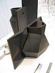
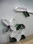
Designer Spotlight: Thelermont HuptonEssex — Some people make the mistake of thinking that Thelermont Hupton is a person. In fact, the name is not attached to one person, but rather, a combination of two: Yve Thelermont and David Hupton. A wobbly seat, hand gesture hooks, a security camera that is really a mirror, a coat rack comprised of climbing men, or the latest (literal) sawhorse table, their products often evoke a smile from visitors at a trade fair |
|
EcoChic: Don't Be Edited off of the Sales FloorWorldwide — 'Choice editing' is a perfect example of why companies cannot afford to not implement a green strategy. Lenzing sees that ecological awareness and ethical concerns are becoming the new criteria of differentiation for environmentally conscious customers. Learn more about their greenness and the trends and color directions (Pantone) for Autumn/Winter 2011-12 here. |
|
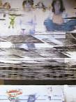
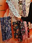
NEWSLETTER #304Paris — I'm not sure which language to greet you with today, as my last 48 hours have been spent between Paris (France), Doha (Qatar), Bangkok (Thailand), and Singapore. This weeks gallery is all about fashion textiles for Spring/Summer 2011 presented at Première Vision. Subscribers can login to read more and see some examples of the fabrics for the next year. |
|
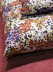
NEWSLETTER #305Worldwide — As we have said before, designs with pixels are still coming on strongwe have even discovered ceramics with a pixelated look! Dishes, towels, bedding, wallcoverings, window treatments, floor coverings, upholstery, and other products abound in this weeks gallery. |
|
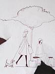
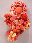
NEWSLETTER #306Paris — Smiley Inspirations interprets the Spring-Summer 2011 trends in terms of accessories and textures. Unfamiliar textures and graphic directions, styles put to unexpected uses and eco-design forecast the creative tendencies of the S/S 2011 season. Inside are highlights of the trends presented at the event, including the inspirations, stylings, colors, and samples for each of the eight themes and view 50+ images. |
|
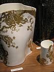
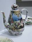
NEWSLETTER #307 - New TalentFrankfurt — Greetings design lovers! Spring is here, and how lovely it is; a time for new beginnings, growth, and warmth. The temperature is rising and blossoms are starting to bloom. And which room of the home has corresponding activities? Thats right, the kitchen! This weeks gallery includes Marchs new talent feature all about fresh tabletop and kitchenware products. |